Work

Tonka Bay Equity Partners:
Building bigger, better businesses.

brand refresh
web design/development
marketing communications

Results:

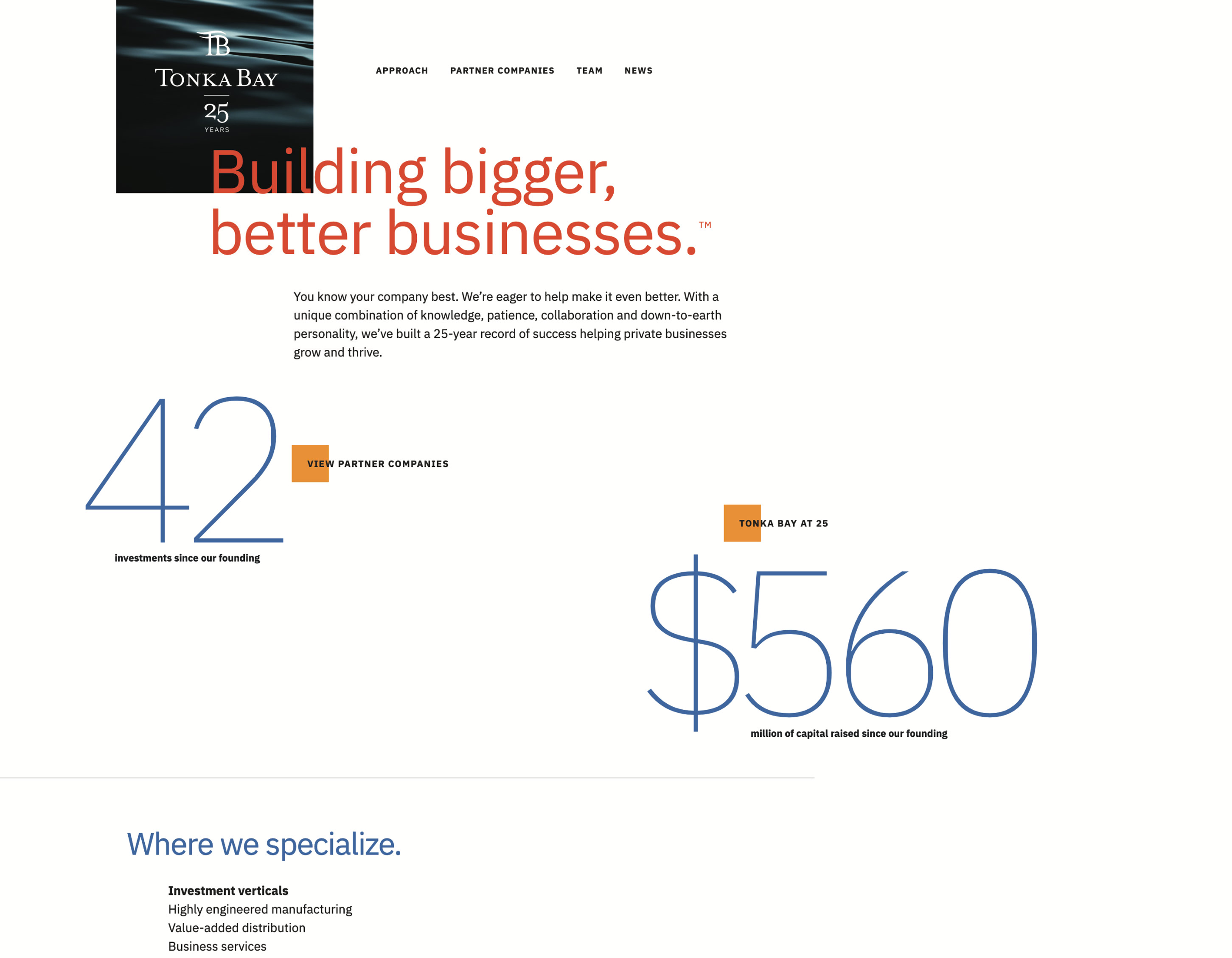
The refreshed brand appearing across all communications presents Tonka Bay’s longevity, successful partnerships, and notable growth.

Screenshot of Tonka Bay Equity's website Screenshot of Tonka Bay Equity's website
Screenshot of Tonka Bay Equity's website

Direct, approachable, and accomplished.

The site makes clear the firm’s business focus, as well as its uniquely talented and personable team of professionals.

visit site
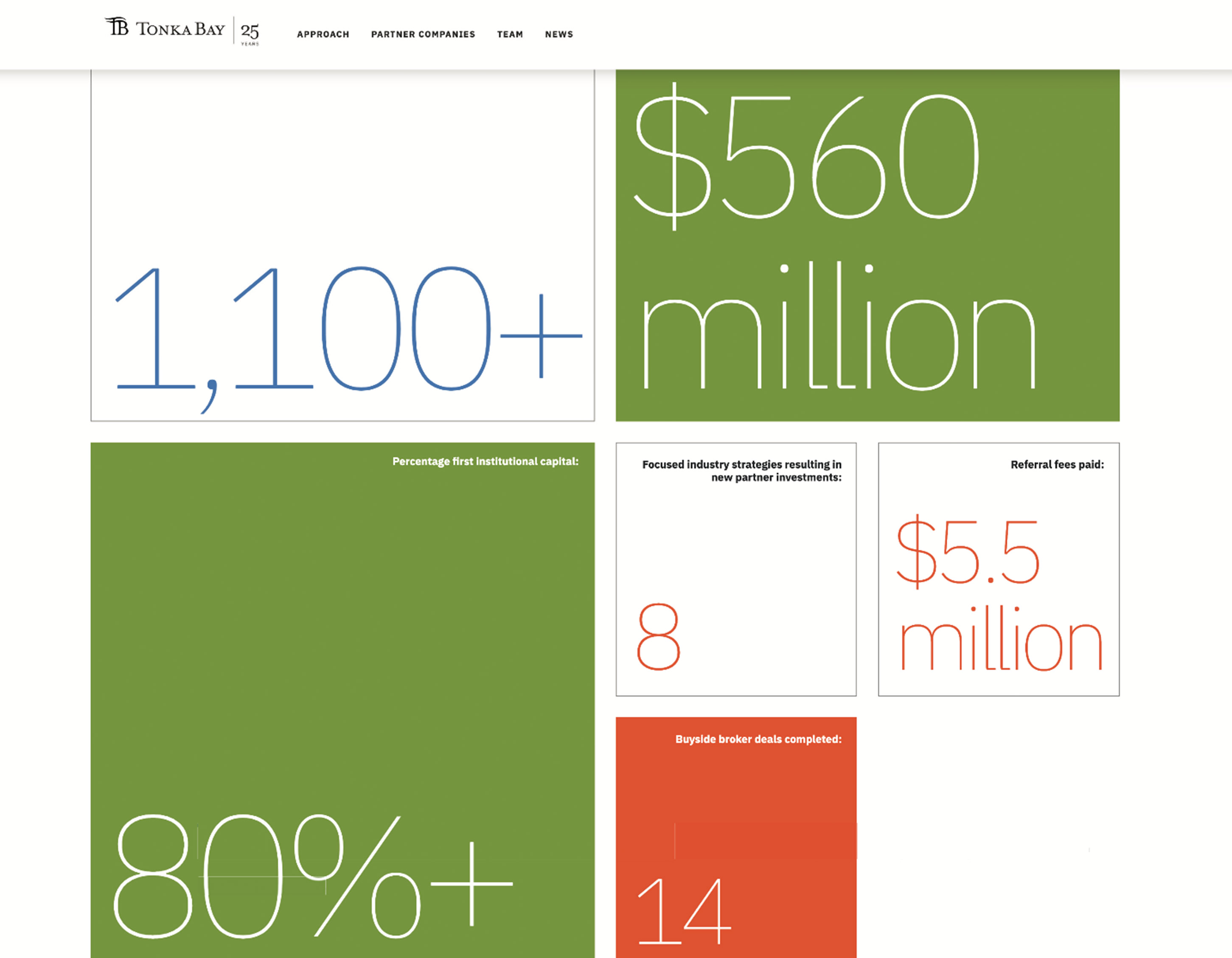
Screenshot of Tonka Bay History Page

A bold snapshot of results.

Tonka Bay results are given a colorful and graphic treatment to quickly convey the facts.

Tonka Bay Equity - Screen showing bright palette, approachable team photography, clean and light typography.

A new Tonka Bay visual language applied to all elements — website, email campaigns, and print materials.

Bright palette, approachable team photography, clean and light typography.


previous | next

return to work