MSP:
Nano and microparticle experts.
MSP now communicates a consistent visual brand that is intentional, confident, and differentiated from competitors.
Clear typography with a meaningful symbol.

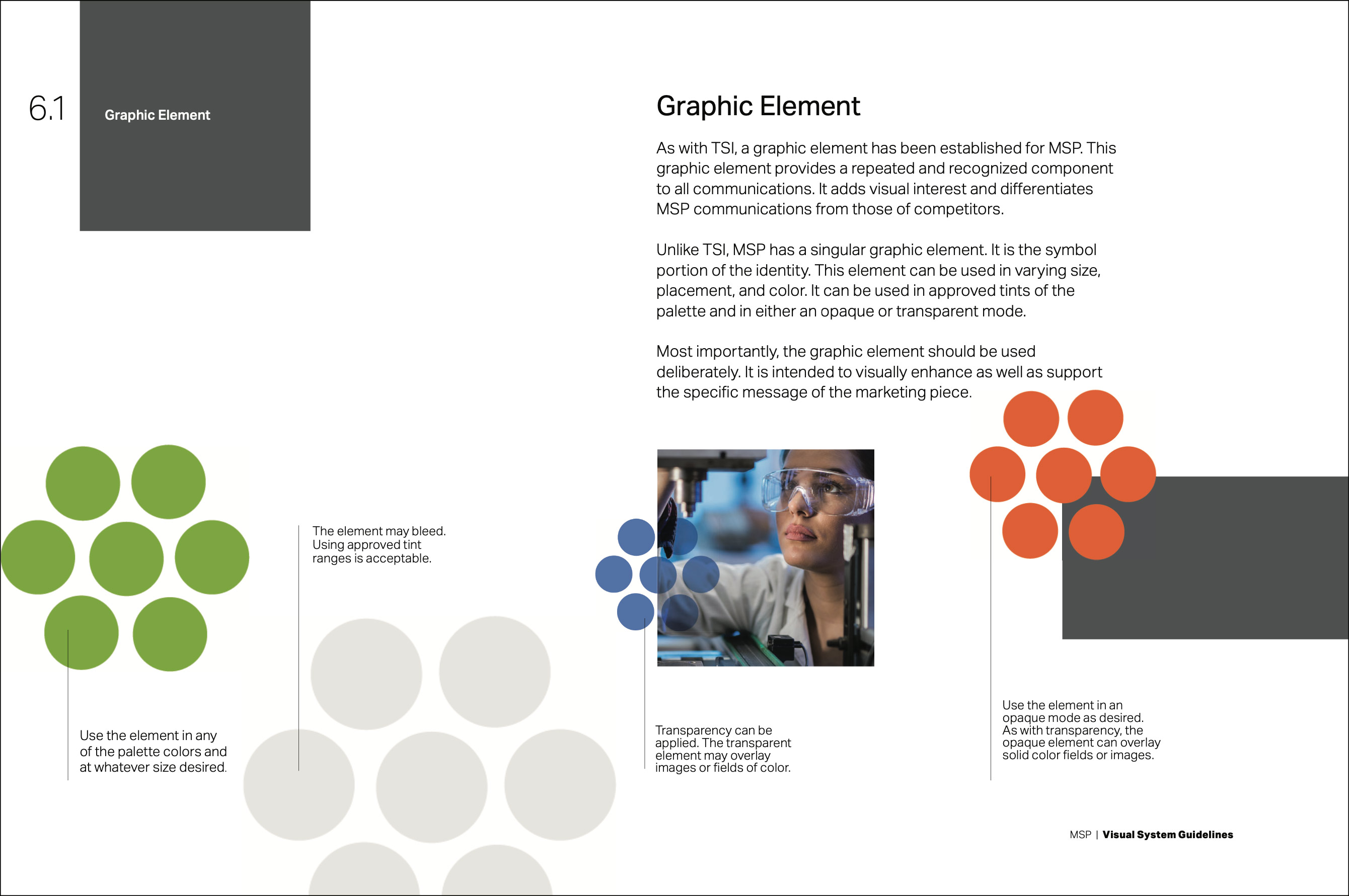
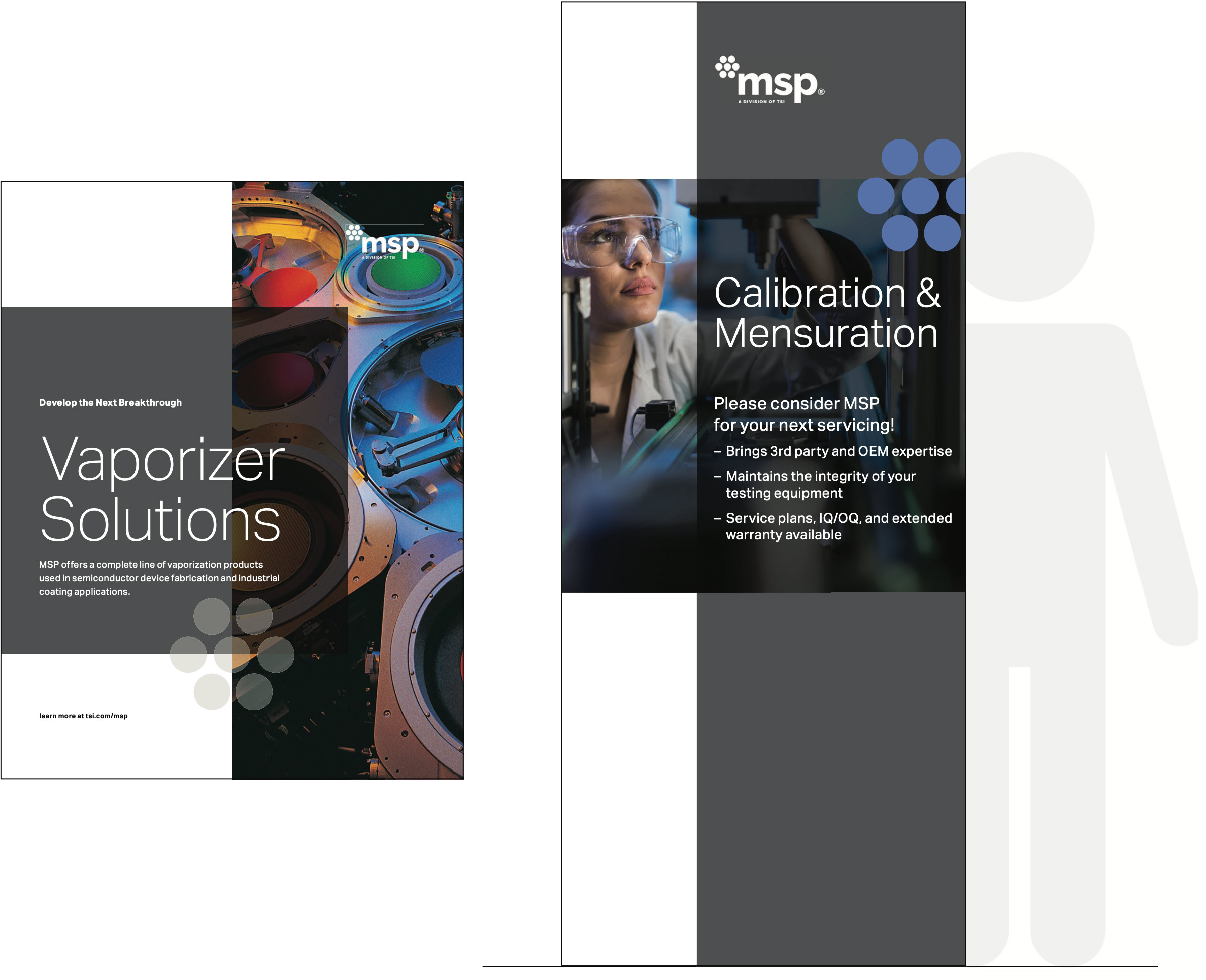
Type, color, graphic elements, and imagery are selected and used in a manner that aligns with the visual brand of MSP’s parent company, TSI.

System guidelines provide a roadmap for creating all materials — both online and in print.

With careful attention to individual letterforms, the sculptural artwork boldly represents MSP’s commitment to its mission.
Constructed with multiple layers and translucency, the combination of shadow and light engages the viewer and adds beauty and interest to the public space of the firm’s offices.