Greater Minneapolis Crisis Nursery:
Helping kids.
By capitalizing on the unifying factor of the kids, the needs of the Nursery’s three distinct audiences — those that use Nursery services, individuals supporting the Nursery, and Nursery volunteers — are addressed and met.

Kids are the visual focus throughout the site — as well as the reason the Nursery exists.

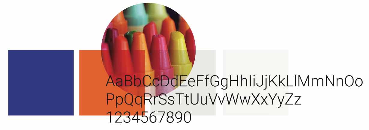
Visual guidelines align communications to the spirit of the organization.
The result is a site with a clear messages, approachable images, and easy navigation to what is needed.
visit site